TYPOLOGY BOOK
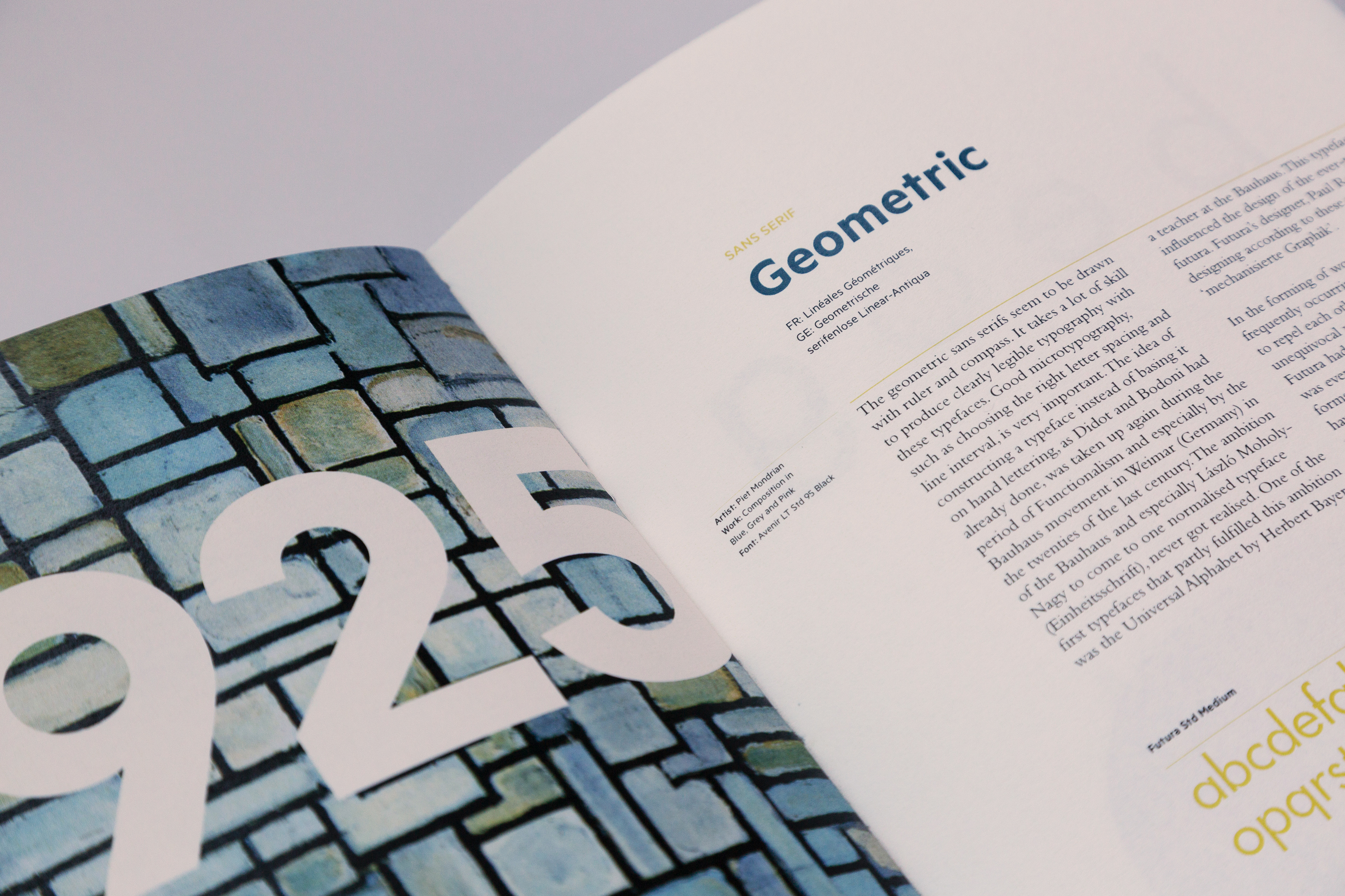
This 80 page editorial book is a catalogue and history of typefaces. They are sorted into a variety of groups and ordered into the year that they were designed. Each set of typefaces are accompanied with an artwork from that time period. For example, an abstract painting from the artist, Mark Rothko is placed with the Neo- Grotesque group from the 1950's. The grid and colour palette of mostly blue, orange and black is cohesive throughout the entire work. The layout consists of a flush-right asymmetrical grid. Each group starts with a history that then goes into the characteristics on the second spread. It comes with an example of a typeface within this group. As with other catalogs, this allows the content to feel connected and easier to be used as a resource.
The final book is printed on an off white paper stock with a weight of 120gsm. It is saddle sewn with a card cover and an orange fabric spine. This work is intended to go with a type specimen that is meant to be attached to the front of the book. This is also included in this portfolio.
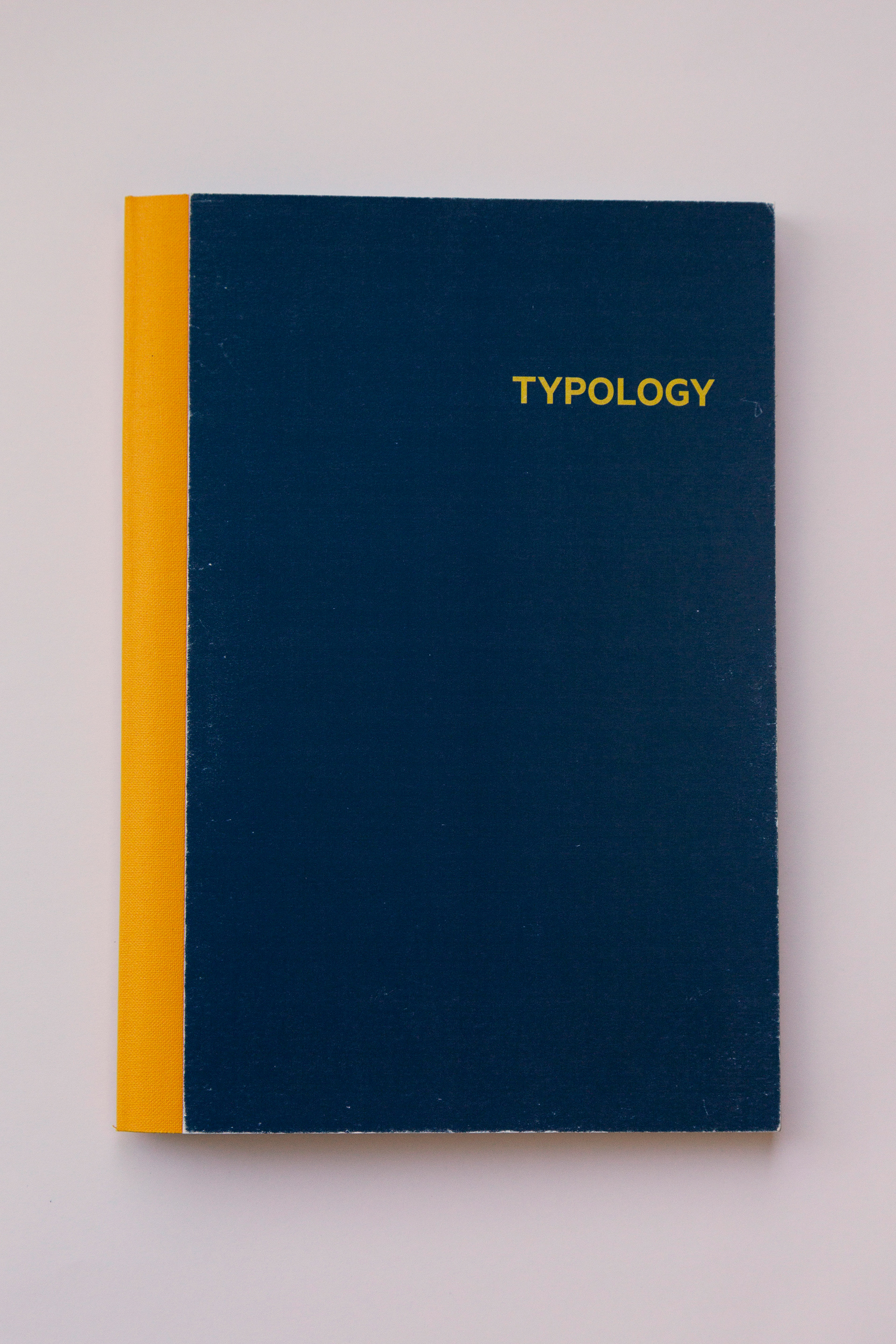
Front Cover Typology Book
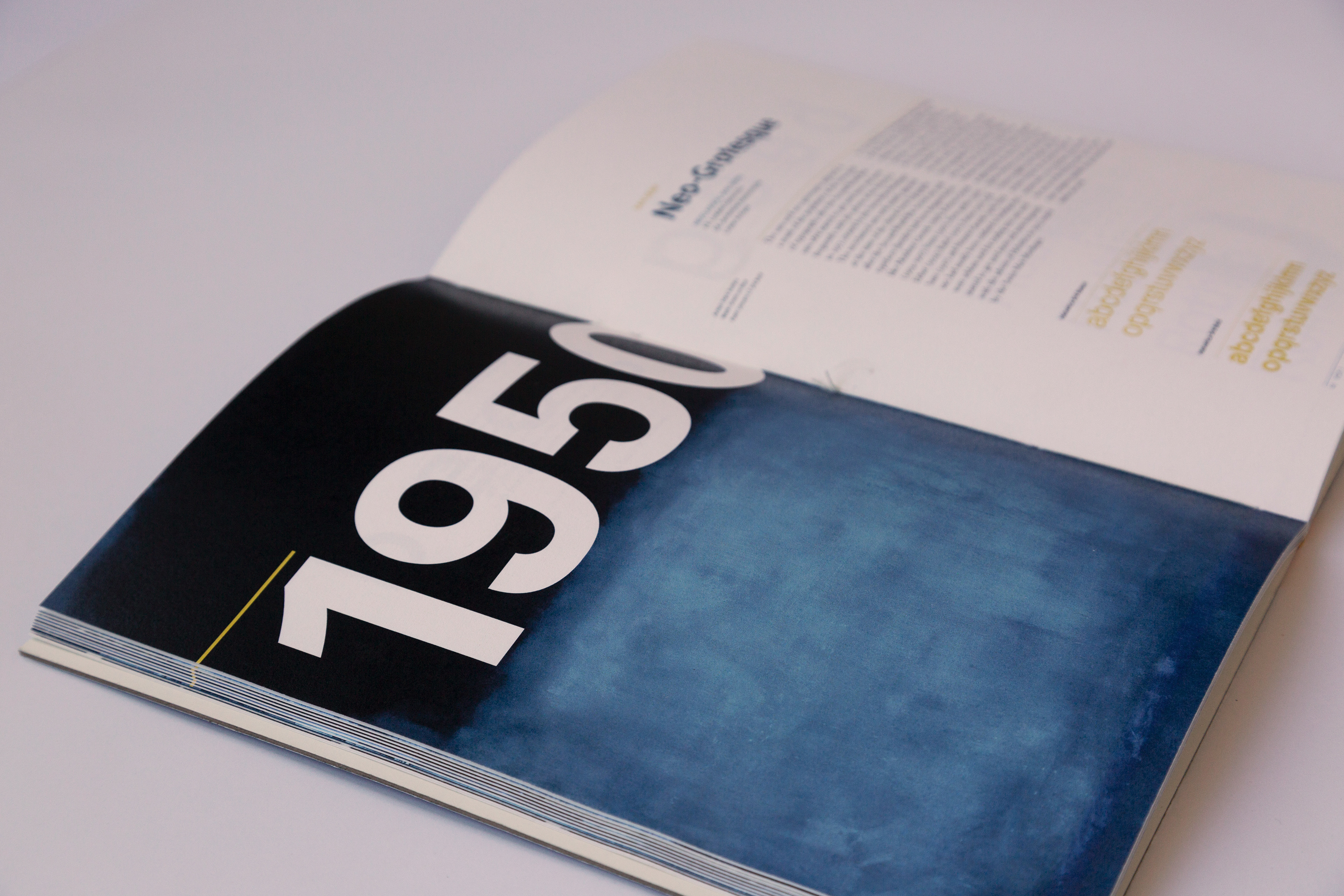
Neo- Grotesque First Spread-1950's, Mark Rothko painting
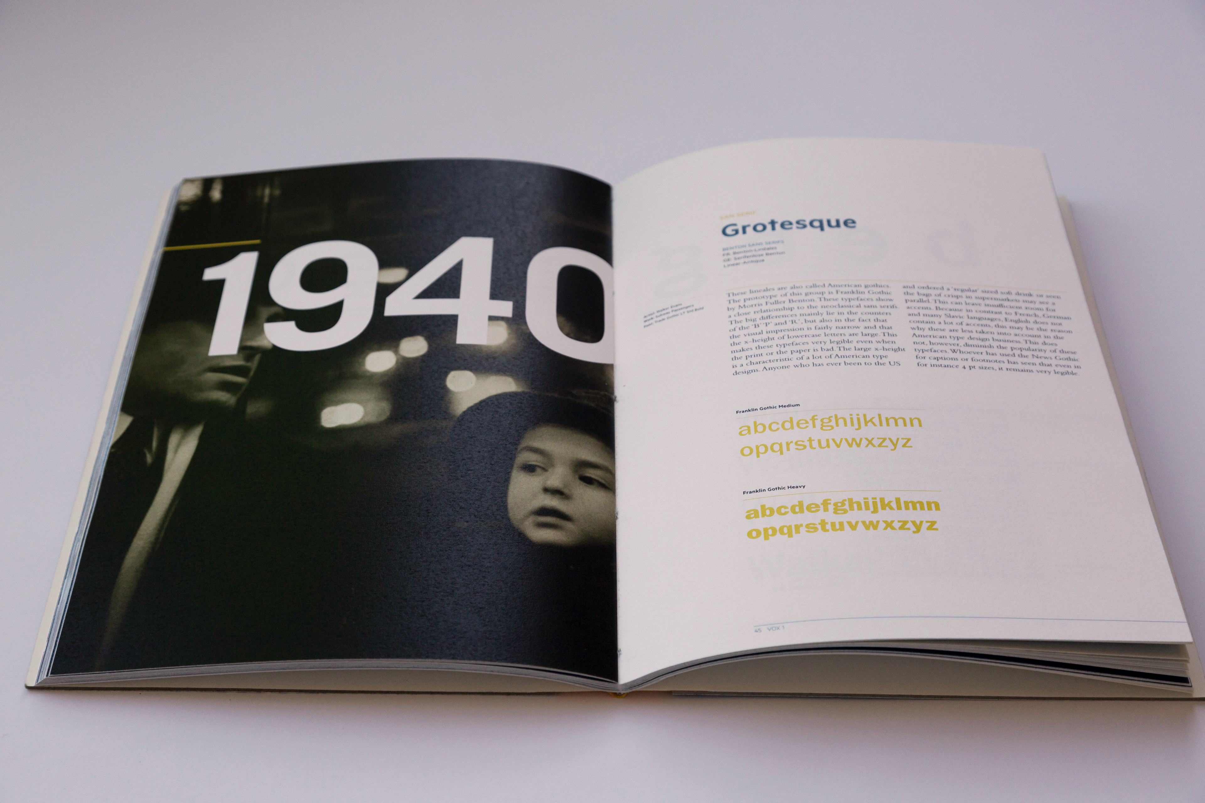
Grotesque First Spread, Photo: Subway Portrait, Walker Evans. 1940's.
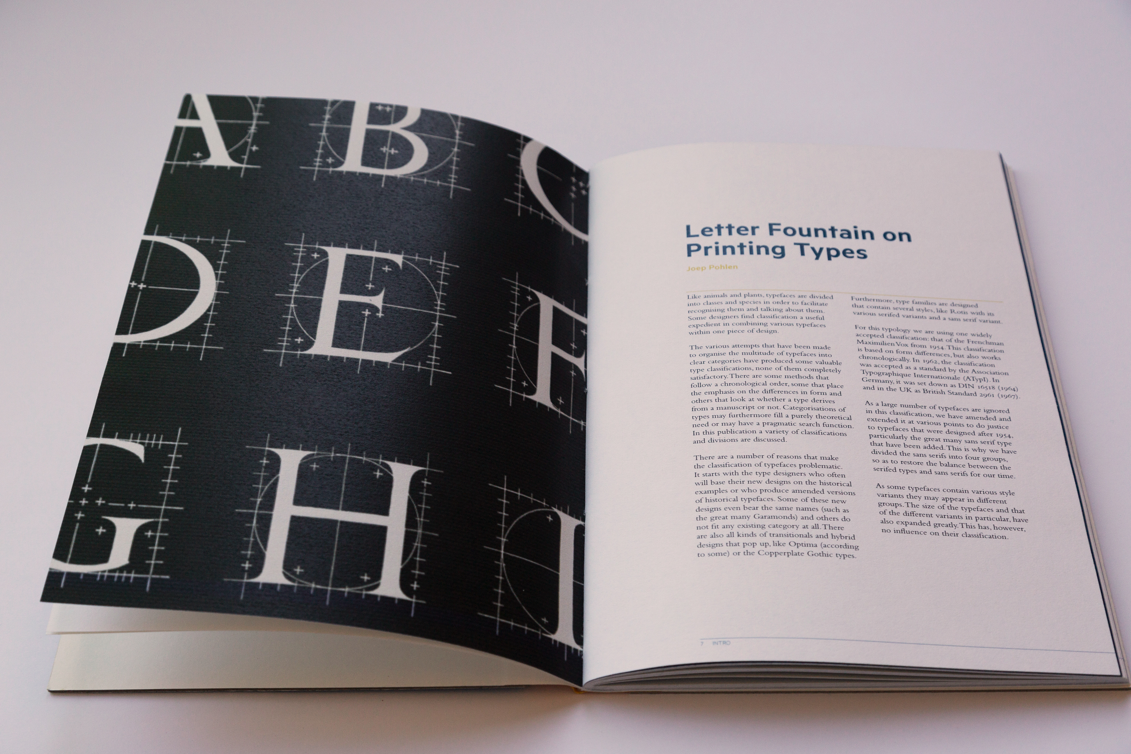
Introduction Spread Article, Image: Letter Fountain book cover. Joep Pohlen.